Constructions
While small, the mini lessons that we did for constructions as a part of the geometry lessons for this year were incredibly interesting. The concept of creating perfect squares or equilateral triangles was so interesting to me. As we learned the steps for doing the different constructions like bisecting lines or angles, and creating shapes using circles and angles I explored more and found that if you extend the compass lines when making a hexagon you could make a rosette of sorts.
We created art pieces using only constructions and no measurement of any kind at the end of the mini unit and I combined all that I knew from what I had studied before. I even went on my own exploration when looking at how to do different types of constructions and I would recommend that you visit the site www.mathopenref.com/constructions.html at the bottom of the page there is a list of different construction tutorials that show you how each step is done with captions for further explanation.
I still have much to learn about constructions and why they work out like they do but I am eager to find out.
Statistics
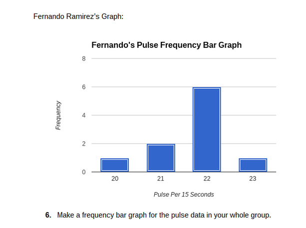
In our latest project we looked into interesting aspects of statistics that I didn't pay much mind to or didn't know about before. We looked at frequency bar graphs and how they are formatted. This was a bit tricky for me to get at first because of the way it was formatted with the amount of times something happened on one axis (the frequency) and the set of data points on the other axis, I often couldn't interpret the data easily or didn't know what to label when we made our own frequency bar graphs. After a bit of practice and working with some data sets that we got from measuring different tasks in groups, I started to understand how the numbers fit together and how to insert data on a frequency bar graph.
|
|
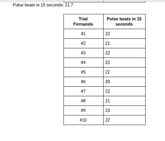
These pictures are some of the data we gathered in the first Gathering Data activity where we took our pulses, stride lengths, and reaction times. We recorded this information on tables and for some we made frequency bar graphs on Google Sheets.
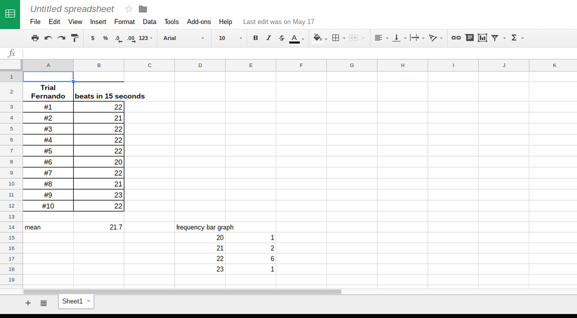
(Using Google Sheets to create frequency bar graphs)
As the project progressed we learned about Standard Deviation. We started with a worksheet called Rinky, Dinky, and Minky that gave us different sets of data that all had a mean of 20 but different people applied different formulas to solve how spread out the data was from the mean, this taught us about what data spreads look like and more importantly what bell curves look like. Bell curves or normal curves are when data on a bar graph have a pretty smooth, defined curve that goes up and down resulting in a bell shape this happens when the mean is in the center of the data and the surrounding data builds up and down around the mean. We then proceeded to learn about deviations and how with a normal distribution there is a certain distance from the center or mean that is defined as the Standard Deviation.
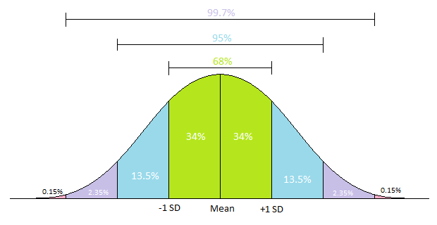
(1 standard deviation in the green)
We continued by combining what we knew into one big gathering data/ calculation activity when we did the whole class data gathering. We went outside to do four different activities where we each had four trials for each activity, the four activities were running the length of the basketball court, hopping the width of the volley ball to the end and back, skipping the length of the basket ball court and back, and how many push ups you could do in 15 seconds. We took that data, put it in a spreadsheet, created a frequency bar graph for each data set and also used commands and many formulas to get the Standard Deviation of the data sets.
